Tag Archives: Visual art

Synchromism’s optics and acoustics

The avant-garde artistic movement known as synchromism was founded in Paris in 1913 by the American modernist painters Morgan Russell and Stanton Macdonald-Wright. Initially focused on figurative art, the two artists, after relocating to the French capital, began to explore the properties and effects of color, drawing inspiration from the artistic currents that had emerged in the late 19th century. Russell coined the term “synchromism” by combining the word “symphony” with “chrome,” inspired by idea of color and music blending together. The resulting artwork, called synchromies, used the color scale in a manner similar to how notes are arranged in a musical composition. Synchromism, in its prismatic approach to space through the decomposition of light, is grounded in the belief that color and sound are analogous phenomena. Color, in this sense, can be orchestrated on canvas or paper in much the same way a composer arranges frequencies, timbres, and modulations in a musical score.

The idea that a painting could be conceived based on a predetermined chromatic range was circulating in the artistic manuals of the time. Russell seemingly drew on the ideas of Canadian painter Percyval Tudor-Hart, whose lectures he attended with Macdonald-Wright in Paris. Tudor-Hart believed that sounds and colors are similar, both in their psychological effects and in the way they are perceived. Convinced that exact physical and mathematical correspondences between the two phenomena could be demonstrated, he proposed that, just as musical octaves are based on the progressive increase in frequencies, a similar principle applies to color scales.

Morgan Russell’s Cosmic synchromy (1913–14).

When considering other sound parameters, he drew parallels between acoustics and optics: pitch corresponds to brightness, intensity to color saturation, and timbre to the tone of color. In traditional chromatic models, the colors of the spectrum are uniformly distributed around a circle. However, in the pattern proposed by Tudor-Hart, the three primary colors—red, yellow, and blue—are equidistant, as are the three secondary colors—orange, green, and violet (or purple). By inserting six intermediate or tertiary colors between the primaries and secondaries, a chromatic circle consisting of twelve colors is formed. If each sector of this circle corresponds to a semitone in music, one could theoretically construct major and minor scales of light frequencies by selecting a different color as the tonic for each scale.

Stanton Macdonald-Wright’s Stony river rippling, lightning flickering.

Macdonald-Wright’s Treatise on color, a self-published theoretical guide for the students at the Art Students’ League of Los Angeles, closely resembles the approach proposed by Tudor-Hart. In this work, Macdonald-Wright provides a detailed discussion on how to create color scales and demonstrates how chord inversions, transpositions, and modulations between keys can be achieved. To help readers visualize these concepts, he suggests imagining the twelve colors arranged along a keyboard, with each primary, secondary, or tertiary color corresponding to a specific note of the musical scale.

This according to the entry on synchromism in DEUMM Online.

Leave a Comment

Filed under Acoustics, Uncategorized, Visual art

Futurist art and the nonpitched machine

Luigi Russolo’s contributions to art and music extend beyond his well-known manifesto, L’arte dei rumori (The art of noises). While he has been celebrated for his theoretical and practical advancements in noise music, his role as a painter and his impact on futurist art are equally significant. As one of the signatories of the futurist painting manifesto (1910), Russolo was deeply involved in the early development of futurism, an artistic and social movement that celebrated modernity, technology, and the dynamism of contemporary life. His painting Treno in velocità (Speeding train), a pivotal work that reflects the futurist fascination with speed and technological progress, exemplifies this enthusiasm for capturing movement and modern machinery.

House+Light+Sky (1913)

In his paintings from this period, Russolo explored the themes of motion, not just through the depiction of machines like trains and automobiles, but also by capturing the energy of crowds of protesters and other dynamic urban scenes. This exploration extended well beyond visual art into the realm of sound, culminating in his manifesto on noise, where he argued for a broader appreciation of the everyday sounds of industrial and urban life.

Synthèse plastique des mouvements d’une femme (Plastic synthesis of a woman’s movements, 1912)

Russolo’s invention of the intonarumori (noise instruments) was a direct extension of his artistic principles. These instruments were designed to produce a variety of noises, challenging conventional notions of musicality and embracing the sounds of the modern world. His compositions for these instruments anticipated future developments in experimental music and had a lasting influence on composers like George Antheil, Edgard Varèse, and John Cage. Russolo’s work represented an innovative fusion of visual art and sound, reflecting the futurist ideals of embracing the new and the dynamic. His influence extended into music and remains a testament to his innovative spirit in both the visual and auditory domains.

This according to “Pasajes sonoros [y ruidistas] de la ciudad futurista” by Juan Agustín Mancebo Roca (Ausart aldizkaria: Arte ikerkuntzarako aldizkaria/Journal for research in art/Revista para la investigación en arte 9/1 [2021] 127–142; RILM Abstracts of Music Literature, 2021-16831). Also find the entry on Luigi Russolo in A dictionary of the avant-gardes (2001). Find it in RILM Music Encyclopedias.

The image at the beginning of this post is Russolo’s Dinamismo di un’ automobile (Dynamism of a car, 1913).

Below, the musician Mike Patton and Luciano Chessa test out reconstructed futurist noise machines based on intonarumori for an exhibit.

Comments Off on Futurist art and the nonpitched machine

Filed under 20th- and 21st-century music, Instruments, Sound, Space, Visual art

Lettrism’s language art

Initiated by Isidore Isou (born Jean-Isidore Goldstein), a young refugee from Romania, lettrism was a multidisciplinary creative movement that began in Paris in 1946 but soon expanded by attracting numerous creative people. Lettrist work was inspired by calligraphy, initially for books but also for visual art. In the age of print, it was quite innovative, although it may not have fared as well in preprint times. One recurring device is letters that resemble verses, even though they are devoid of words. Prominent writers and artists based in France such as Jean-Louis Brau, Gil J. Wolman, Maurice Lemaître, Roberto Altmann, Roland Sabatier, and Jean-Paul Curtay were among those associated with the group at various times.

The movement was named Lettrism because historically it was first and foremost interested in rethinking poetry, which at the time was judged to be exhausted when conveyed simply through words and concepts. Poetic lettrism clearly and systematically for the first time (taking inspiration from Dada) proposed a new conception of poetry entirely reduced to letters and eliminating all semantics. Not unlike other self-conscious agglomerations, lettrism was particularly skilled at producing manifestos which can be read with varying degrees of sense. By discounting semantic and syntactical coherence for language art, some lettrist works are considered the precursors of concrete poetry. Among the alumni are Guy Debord (1931–94), who is commonly credited with initiating the Situationist International (1958–72), which, according to some, represents art’s most profound, courageous, and successful involvement in radical politics. While Situationist writings have been translated into English, lettrist texts largely have been left out.

Find out more about lettrism in A dictionary of the avant-gardes. Find it in RILM Music Encyclopedias (RME).

The first image above was created by Roberto Altmann, and the second by Maurice Lemaître–both were artists associated with the lettrist movement.

Below is a video of Orson Welles interviewing Isidore Isou about lettrism and sound poetry in 1955. Be sure to turn up your volume when watching it.

Comments Off on Lettrism’s language art

Filed under Curiosities, Humor, Literature, Sound, Visual art

Charles Schultz and classical music

Having once considered himself “one of the staunchest opponents of classical music”, Charles Schultz discovered the symphonies of Beethoven in 1946 and became an avid fan of classical music with a prodigious record collection. He also created the piano-playing Schroeder, a Beethoven fanatic, for his comic strip Peanuts.

A well-worn 1951 LP in Schultz’s collection by the pianist Friedrich Gulda of Beethoven’s Hammerklavier sonata may have inspired a series of strips from the early 1950s in which Schroeder is seen playing this work. The one reproduced above is the only one in which the piece is named, though it still relies on the reader to read music—and German!—for a full identification. Note Schultz’s imitation of German Fraktur script for both the work title and his signature.

This according to “Michaelis’ Schulz, Schulz’s Beethoven, and the construction of biography” by William Meredith (The Beethoven journal XXV/2 [winter 2008], pp. 79–91; RILM Abstracts of Music Literature 2008-8914).

Today is Schultz’s 100th birthday! Below, Gulda performs the Hammerklavier sonata in 1970.

More posts about Beethoven are here.

5 Comments

Filed under Classic era, Curiosities, Humor, Visual art

Hogarth and dance

William Hogarth explicitly positioned his aesthetic theory in opposition to those of his contemporaries.

He disagreed both with philosophical treatments that viewed beauty and taste in moral terms and with art treatises that relied on exemplification and lacked causal explanation; further, he attacked the mystification of the concept of grace in both approaches.

He argued that understanding beauty did not require initiation into a new body of knowledge: It simply involved exercising a natural reflective vision that finds pleasure in the forms of the human body and related designs and ornamentations.

It was natural, therefore, that—unlike other aestheticians of his time—he drew extensively on dance examples in his treatise The analysis of beauty: Dance, particularly in its use in deportment training, belonged to a sphere of relatively everyday polite culture, as opposed to the rarefied and mystifying culture of art appreciation. Anyone open to dance and deportment could learn how to appreciate them, just as anyone open to Hogarth’s theory could apply its illuminations to their everyday lives.

This according to “An aesthetics of performance: Dance in Hogarth’s Analysis of beauty” by Annie Richardson (Dance research: The journal of the Society for Dance Research XX/2 [winter 2002] 38–87; RILM Abstracts of Music Literature 2002-11454).

Above, an illustration of a country dance from Hogarth’s treatise (click to enlarge). Below, an English country dance that he might have seen—or participated in!

1 Comment

Filed under Dance, Visual art

Morton Feldman and Persian carpets

Repetition and variation are important components of the music of Morton Feldman—components that he extracted from his observation of Persian carpet designs.

Rug design and music are arts that use symbolic language to express certain concepts with a focus on the idea of unity in multiplicity. The designs of some Persian carpets are based on the weaver’s mind map, which resembles Feldman’s musical approach. Key elements of these carpet patterns correspond directly to Feldman’s use of repetition and symmetry in his works.

This according to “A study on the rug patterns and Morton Feldman’s approach” by A.A. Javadi and M. Fujieda (International journal of music science, technology and art II/1 [2020] 48–53; RILM Abstracts of Music Literature 2020-3041). Many thanks to Improbable research for bringing this study to our attention!

Above, a comparison of selected carpets with excerpts from Feldman’s Crippled symmetry; below, a performance of the work.

Related post: Morton Feldman’s The viola in my life

1 Comment

Filed under 20th- and 21st-century music, Curiosities, Visual art

Roy DeCarava’s photographic aesthetic


The legacy of Roy DeCarava, particularly his collection The sound I saw: Improvisation on a jazz theme (London: Phaidon, 2001), illuminates how his photographic method, both in individual photographs and in the way they are sequenced, absorbed jazz technique and mimicked jazz performance.

DeCarava’s aesthetic can be seen as both a distinctively black aesthetic and a profoundly inclusive one. His unflinching but caring eye is cast over the debris of the ghetto as well as the ecstasy of the jazz solo, and it observes the cramped but welcoming dark of the metonymic Harlem hallway.

This according to “‘And you slip into the breaks and look around’: Jazz and everyday life in the photographs of Roy DeCarava” by Richard Ings, an essay included in The hearing eye: Jazz & blues influences in African American visual art (New York: Oxford University Press, 2009, pp. 303–31).

Today is DeCarava’s 100th birthday!

Above, Dancers (Dancers at the Savoy Ballroom, 1956) by Roy DeCarava is licensed under CC BY-NC-ND 2.0.

Below, a brief documentary.

Comments Off on Roy DeCarava’s photographic aesthetic

Filed under Black studies, Jazz and blues, Visual art

Harvey Pekar and jazz

Harvey Pekar, author of the autobiographical comic series American splendor, was also a jazz fan, an obsessive record collector, a prolific jazz critic, and a tireless supporter of experimental music; he often worked these enthusiasms into his comic strips.

These comic-book treatments of jazz can be viewed as extensions and developments of his prose criticism in publications such as The jazz review and DownBeat. In these comic strips, Pekar was experimenting with the form of jazz criticism itself, and was developing its language and impact.

This according to “Comics as criticism: Harvey Pekar, jazz writer” by Nicolas Pillai, an essay included in The Routledge companion to jazz studies (New New York: Routledge, 2019, pp. 433–41).

Today would have been Harvey Pekar’s 80th birthday! Above, Robert Crumb’s depiction of Pekar and himself for an American splendor cover; below, a promo clip for Harvey Pekar’s world of jazz.

Comments Off on Harvey Pekar and jazz

Filed under Humor, Jazz and blues, Visual art

Norman Lewis’s “pure eye music”

The African American artist Norman Lewis’s artistic background was similar to those of the abstract expressionists; but with abstract expressionism defined chiefly by white male artists and critics, Lewis’s contributions to the movement were ignored.

Abstract expressionism valued originality apart from European influence, yet Lewis borrowed ideas from Picasso, Mondrian, Klee, and Kandinsky to recontextualize into his work. Lewis also changed styles frequently. From Musicians (1945), through Jazz musicians (1948, above), to Jazz band (1948, below), a development can be traced—from depicting overt human forms merging with musical instruments, through human forms gradually more abstracted, to emphasis on visual interpretation of musical lines, sound, embellishments, and rhythms (called “pure eye music” by the critic Henry McBride).

While Lewis’s blending and recombining of many artistic influences may have run against the abstract expressionism aesthetic, his recontextualizing of styles parallels the innovative borrowing from standard tunes and chord substitution that were characteristics of bebop.

This according to “‘Pure eye music’: Norman Lewis, abstract expressionism, and bebop” by Sara K. Wood, an essay included in The hearing eye: Jazz & blues influences in African American visual art (New York: Oxford University Press, 2009, pp. 95–119).

Today would have been Lewis’s 110th birthday! Below, a brief documentary chronicles his artistic development, including references to his jazz-influenced works.

Comments Off on Norman Lewis’s “pure eye music”

Filed under Black studies, Jazz and blues, Visual art

Historic opera scenery

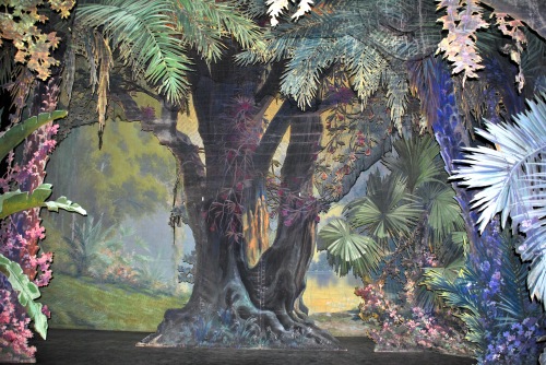
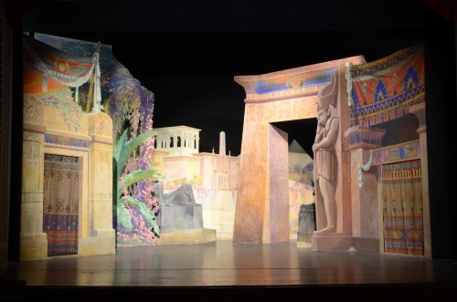
Dubosq 1

The newly discovered scenic collection of the Stadsschouwburg in Kortrijk, Belgium, comprises 13 backcloths, 21 borders, and over 298 framed units, plus authentic stage furniture, practicables, and sound effects.

This forgotten treasury houses a near-complete set of generic stock sets next to genuine production materials for Aida, La bohème, Carmen, Faust, and other blockbusters from the operatic repertoire. The décors were designed and executed by Albert Dubosq (1863–1940), an acknowledged master of the Parisian school of scenic painting,

Despite the groundbreaking research done at a few historical theaters, the study of operatic iconography still tends to focus on visual renderings—designs, artists’ impressions, and photographs—rather than on primary, scenic artifacts thereof, such as flats and drops. The discovery of these valuable holdings allows new examples of authentic scenery to be subjected to scholarly scrutiny.

This according to “Jumbo-sized artifacts of operatic practice: The opportunities and challenges of historical stage sets” by Bruno Forment (Music in art XXXVIII/1–2 [2013] pp. 115–125. Above, Dubosq’s Forêt asiatique for Lakmé; below, his Extérieur égyptien for Aida (both from 1921).

Dubosq

Related articles:

Comments Off on Historic opera scenery

Filed under Opera, Visual art